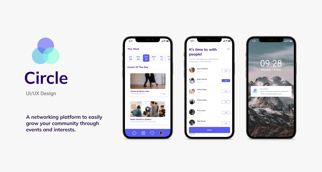
Project Overview
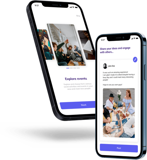
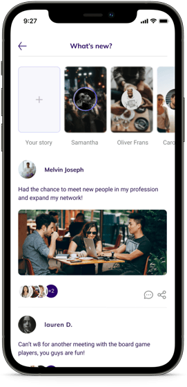
Circle is a creative industry startup intending to connect people through social media. We live in an era where we are isolated from the real world and stuck in monitors. We believe we are connected to our friends and different communities while at the end of the day, we are so alone. In addition, finding new friends who have similar interests with us and engaging in some related activities “in the real world” seems to be impossible in the age of social media. The app is not another social media app; it forces people to get out of their monitors and their homes to meet in person, which is the main factor that makes it different.
Problem
“How might we help people find the right people to network with in online events?”
We believe we are connected to our friends and different communities through social media while we mostly do not all the time find ourselves isolated and alone at the end of the day. In addition, finding new friends who have similar interests with us and engaging in some related activities “in the real world” seems to be impossible in the age of social media and it seems so intimidating to approach people whom we don’t know personally. Moreover, it is not just about dating and trying to find a partner, there is a more serious need in our era to get to know each other and network around a specific topic.
Solution
In Circle, I intended to make the process reverse. Instead of connecting through social media and deciding if you wanna meet with a specific person or group, you must attend an event that you might be interested in and then decide if you want to connect with those you met at the event. Eventually, this allows people to get engaged in social activities more and have the chance to meet with people of similar interests and get o choose whether or not to network with them and grow their circle.
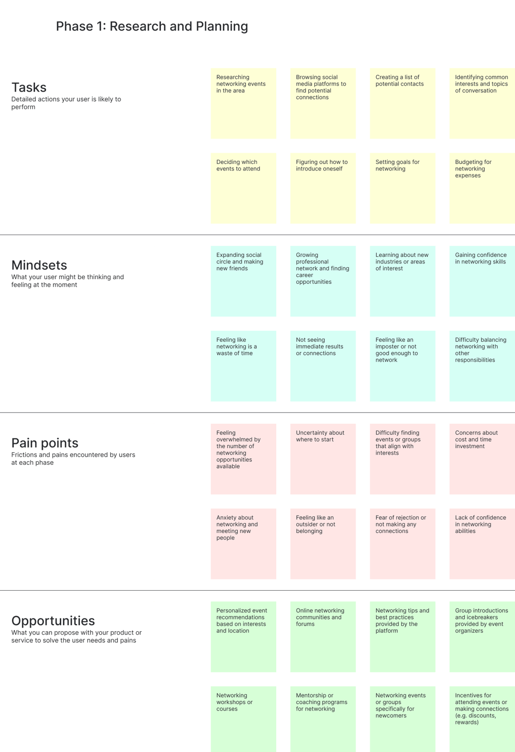
How do people think, feel, and behave while networking?
In addition to the Matchy research findings, I did thorough secondary research about networking at events, people’s behaviors, struggles, and pain points. I used literature reviews, business articles, social media platforms like Quora, Reddit, LinkedIn, etc., and search listening tools like Answer The Public.
The questions that people have answered regarding networking:
- What is the most difficult thing about networking?
- Why is networking hard?
- How do you feel about networking?
- What was your experience with professional networking?
The competition does not encourage to meet in person that much.
I conducted a SWOT analysis of competitors to see the solutions in the market, I analyzed the 5 most popular apps surrounding this Networking/ Event space. I found that almost none of them had this aspect that actually ask people to meet in events and try to network in person.
I analyzed 3 direct (Eventbrite, Meetup, Kommunity) and 2 indirect (Hopin, Bumble Bizz) competitors.

Results of competitive analysis
Top 3 things that I’ve learned:
1. The “Sign up process” is the key factor to decide how to design the whole platform
2. The “Event suggestion system” of each platform is different. It’s important to find the most efficient way to suggest an event.
3. Having a “Consistent UI” can become a key advantage. Most platforms don’t have it.
WHITE PAPER RESEARCH
None of the previous apps my interviewees used encourage people to meet in person before the actually interact with each other virtually on the platform.
Based on the trends in my affinity map, I’ve noticed how if there is no pain or real consequence (accountability) associated with NOT achieving their goal as was the case in previous apps they’ve used, motivation to continue to cease to exist.
THE MAIN INSIGHT
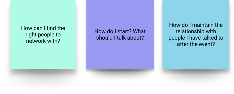
Main pain points:

Problem statement
To build an MVP, we have to solve one crucial problem for users that gives us an edge in comparison with the competitors:
How might we find the right people to meet with and encourage them to meet in person?
Value proposition: The Circle platform process
The Circle process comprises of 3 questions
These questions will help to find the community and events where you are ost likely to meet with people you desire to.
Who you are?


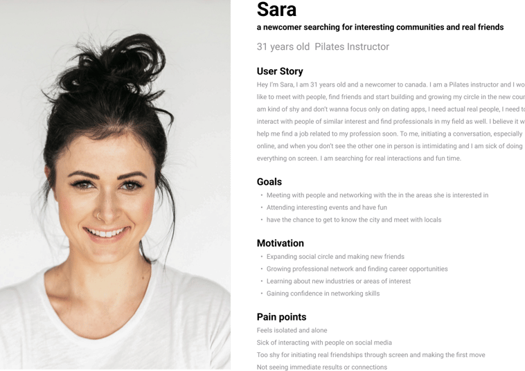
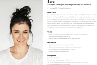
THE PERSONA
Phase 2: Interviewing and knowing the user
1. What areas of interest would you like to explore when networking?
2. What kind of activities or events would you like to attend to make new connections?
3. What type of people have you been wanting to meet and network with?
4. What have you done so far to meet new people and network?
5. What do you think would be the best way to connect with people in the areas of your interest?
THE DESIGN
WIREFRAMING
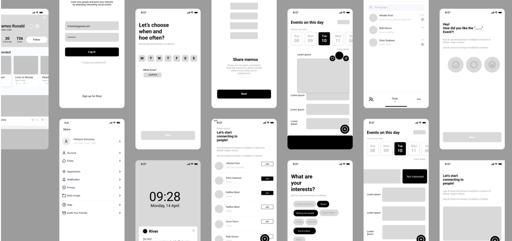
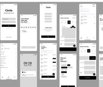
LO-FI Wireframes
After sketching out our wireframes,
we moved into Figma and created low-fidelity wireframes.
Following the user journey map, we chose a single ‘happy journey’ and mapped out the different designs.
VALUE PROPOSITIONS + IMPROVEMENTS
3 main features of my design
We have made quality our habit. It’s not something that we just strive for – we live by this principle every day.
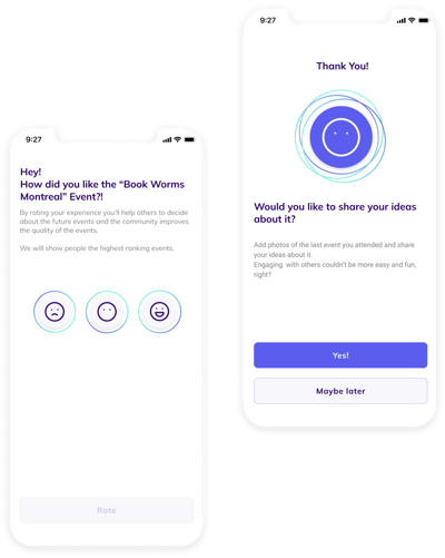
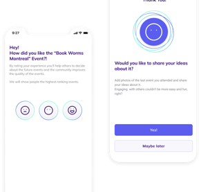
Rating is a must!
Researches show that when we ask for people’s opinion about different matters, they feel more valued and seen. Therefore I realized rating the events they attend helps them get engaged with the app more and encourages them to use it and attend more events.
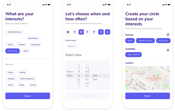
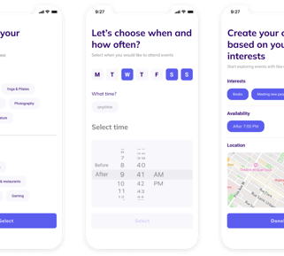
Filtering options
The users have to choose their area of interest and the time schedule they are available or willing to attend the events. This feature allows them to find what they desire faster and find these social activities more tempting. Moreover, the time schedule allows them to see the upcoming events based on their availability.
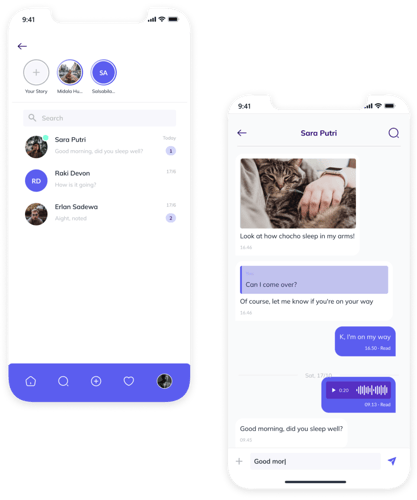
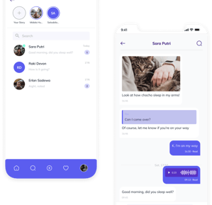
Chat
Chat is a core tool for communication between people, that’s why I tried my best to make it a convenient one.
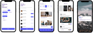
THE FINAL SCREENS
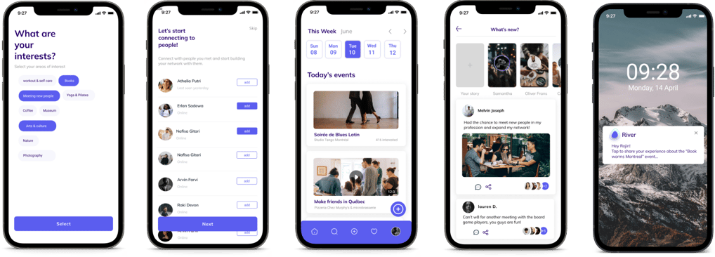
The Final Product
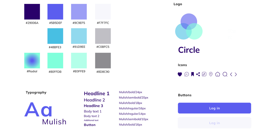
The Style Guide
What I’d do differently next time.
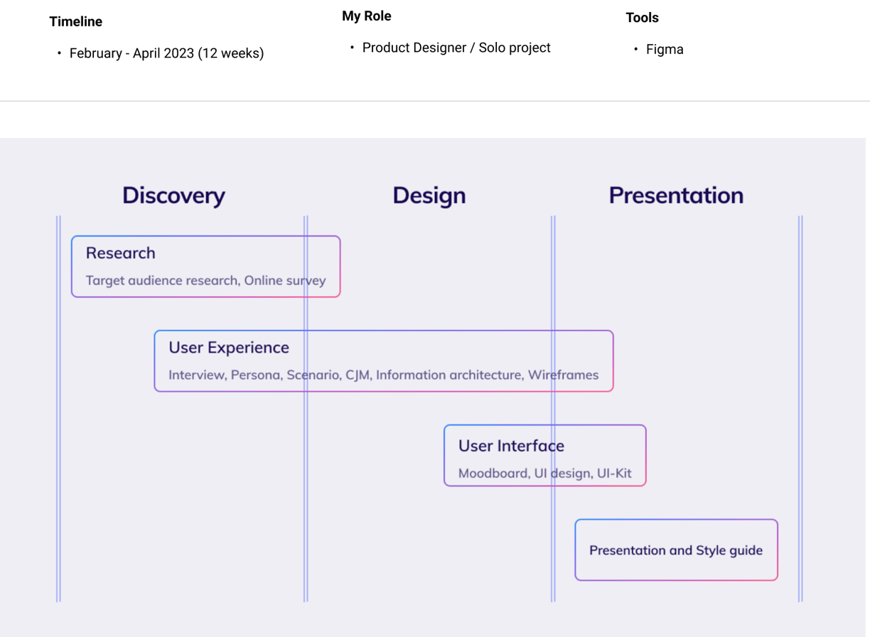
It was a tough 12 week for me to do the entire project all by myself and I’m immensely grateful to have been through an entire UX process so I can see what it’s actually like. On that note, a few things I’ve learned:
1. Iterate as much as you can. In the beginning stages, I’ve explored so many different options to try finding the right solution for my users- I’ve ended up “restarting” my project over 2 times with over 5 iterations of my FIGMA file to make sure every aspect of the app was designed with intention. Not to mention- I have a better sense to obey WCAG standards next time!
2. Take users attention. Since attention is the new currency, my behind-the-curtain business goal was to keep users as engaged as possible.
3. Be insight- not process-driven. Despite weeks of research + development, my first version of this case study was full of unnecessary text at this stage instead of tying everything into the bigger question- “so how does this fit into the bigger picture”? Hence, I cut down the copy by more than 60% and focused on the major points in my project. Hence, going forward I believe focusing more on the insights will improve my storytelling abilities to others.
4. You didn’t fail- you just found 100 ways that didn’t work. From noticing mistakes in my UI to uncovering more foundational UX problems in my app, I’m thankful to have constantly asked for feedback from my peers and my mentor. In the end, I pushed to have the app as best I could, and did not let my own thinking stop me from questioning if my own decisions were truly best for the user.
CONCLUSION + TAKEAWAYS


